theme.json Schema
theme.json sits at the root of a theme folder and does three jobs: it identifies the theme, it carries the theme's own static defaults, and it declares the customizer panel the site owner will see.
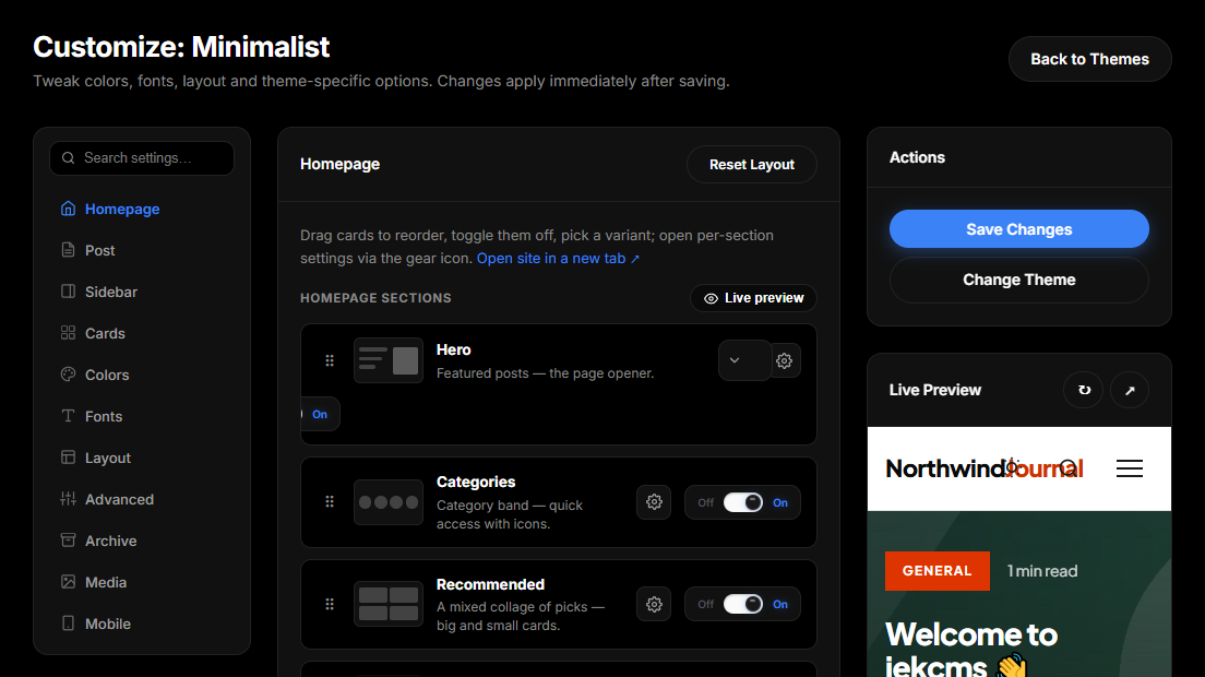
This page lists the keys the code reads. Shipped themes contain other keys as well - license, author_url, minimum_cms_version, menu_locations, image_sizes, assets, templates, requirements among them - which are documentation for humans and are read by nothing. Adding them changes no behaviour; leaving them out breaks nothing.
Identity
| Key | Type | Notes | |---|---|---| | name | string | Required. The theme is rejected as invalid without it | | version | string | Semver. Shown on the theme card and used as the asset cache buster | | author | string | Shown on the theme card | | description | string | One line for the theme picker | | screenshot | string | Filename of the card image, relative to the theme folder | | internal | boolean | true hides the theme from the Themes screen unless it is already active | | language | string | The language the theme's own labels are written in | | labels | object | Theme-supplied wording, read by jek_label() - see below |
There is no slug to set. Every theme.json in the product has one and none of them are read: the slug is always the folder name. Renaming a slug key changes nothing; renaming the folder orphans the theme's saved customizer values.
labels lets a theme override individual strings. A multilingual value is picked by site language; a plain string is used only when the theme's own language matches the site's, which stops an English label from leaking onto a Turkish site.
{
    "labels": {
        "read_more": { "tr": "Yazının devamı", "en": "Keep reading" }
    }
}
The settings block - the theme's own defaults
settings holds values baked into the theme. It is not the customizer: nothing here appears in the admin panel, nothing here is ever written by a user, and nothing here becomes a CSS variable.
{
    "settings": {
        "colors": { "primary": "#2563eb", "text": "#0f172a", "background": "#ffffff" },
        "typography": { "body": "Inter, system-ui, sans-serif" },
        "posts": { "posts_per_page": 12 },
        "features": { "dark_mode": true }
    }
}
Templates read it through the theme's own helper, defined in the theme's functions.php:
$perPage = theme_setting('posts.posts_per_page', 10);Fourteen of the fifteen shipped themes carry a settings block. One key inside it is worth calling out as inert: settings.colors_dark appears in several themes and is read by no code at all - dark colours come from the customizer's dark pairs instead.
The customizer block
customizer is the editable half, and three keys live under it.
customizer.tabs is the panel itself. Each key is a tab; each tab has a label (a string, or a { "tr": …, "en": … } pair), an optional icon and description, and a fields map. Tab keys become the first segment of the lookup key, so branding.accent is the accent field of the branding tab.
{
    "customizer": {
        "dark_selector": "[data-theme=\"dark\"]",
        "tabs": {
            "branding": {
                "label": { "tr": "Marka", "en": "Branding" },
                "icon": "palette",
                "fields": {
                    "accent": {
                        "type": "color",
                        "label": "Accent colour",
                        "default": "#0891b2",
                        "css_var": "--color-accent",
                        "help": "Links, buttons and focus rings."
                    }
                }
            }
        }
    }
}
customizer.dark_selector decides how the dark palette is emitted. Omit it and the default [data-theme="dark"] is used. Set it to "media" and the dark block is wrapped in @media (prefers-color-scheme: dark) instead, which suits a theme with no toggle. Set it to false and the theme opts out entirely - no dark pairs are generated for its colour fields. Any other string is used verbatim as a selector, which is how a theme that switches on a body class keeps working.
customizer.extend_default merges the universal default schema into a theme's own tabs instead of replacing it. A theme that declares no tabs at all gets the default schema automatically.
Field definitions
Every field object accepts a common set of keys.
| Key | Notes | |---|---| | type | Required in practice - an unknown or missing type renders as a plain text input | | label | String or {tr, en} pair | | default | Starting value; default_tr supplies a Turkish-site alternative | | help | Helper text under the control | | css_var | A custom property name, or an array of names, emitted automatically | | placeholder | Shown in the empty input | | optional | Puts the field behind a "Customize" checkbox; unchecked means the theme's own value stands | | emit_saved_only | Nothing is written to the page until the user saves a value | | depends_on | Show this field only when another field holds a given value | | no_dark | Skip the automatic dark twin for this colour field | | dark_default | Starting value for the generated dark twin |
And the type-specific ones:
| Type | Extra keys | Stored as | |---|---|---| | color | - | "#rrggbb" | | font | options, allow_empty | Family name; the shared font library is used when options is absent | | range / number | min, max, step, unit | Number | | toggle / checkbox | - | 1 / 0 | | select | options - a list, or a {"key": "Label"} map | Option key | | choice_cards | options, each with a label and a mock class | Option key | | textarea / code | rows, language | String | | image | - | URL or path | | url / text | - | String |
A tab may also carry fields_columns and fields_heading to group its controls visually.
Layouts - reorderable sections
layouts declares which sections a page is built from and which of their capabilities this theme actually consumes. The customizer turns each row into a draggable card.
{
    "layouts": {
        "home": [
            { "key": "hero", "variants": ["slider", "split"], "settings_allow": ["count"] },
            { "key": "latest", "settings_default": { "count": 6 } },
            { "key": "categories", "default_on": 0 }
        ]
    }
}
key names a section from the core registry. variants whitelists the variants this theme has actually styled; an empty array means the section has no variants here. settings_allow narrows the settings shown for it, settings_default overrides the registry default, and default_on: 0 ships the section switched off.
Declare nothing and the section arrives with the registry's full capability set. Sections a theme does not mention at all are still added - switched off - so a site owner can turn on a universal block the theme author never wired up.
Support flags
supports tells the customizer which optional control groups this theme can honour. Showing a control a theme ignores is worse than not showing it, so these flags gate whole panels.
{ "supports": { "card_options": true, "share_styles": true, "comment_styles": true } }A list form - ["card_options", "share_styles"] - works identically.
The flags that open injected customizer panels are card_options, hero_styles, hero_controls, share_styles, comment_styles, author_box_styles, sidebar_styles, section_title_styles, typography_controls and layout_controls. Other flags appear in shipped manifests (dark_mode, widgets, menus, custom_logo and so on) as declarations of intent that no core module reads.
Card and hero trimming
Three small keys let a theme opt out of parts of the universal card and hero machinery, for designs where a control would produce nothing visible.
card_defaults sets this theme's starting values for the injected Cards tab. card_omit lists card controls to hide. hero_omit does the same for the hero. footer_kit_default picks the theme's default footer kit.
Top-level colours and fonts
colors and fonts may appear at the top level, outside settings. They exist as a fallback for the theme card's swatches and are read nowhere else. New themes should put their palette in settings.colors and their editable colours in customizer.tabs.