Theme Customization
Appearance → Customize is not a fixed screen. It is generated: jekcms reads the active theme's theme.json, adds a set of controls that every theme gets whether it asked for them or not, and renders the result as a tabbed panel with a live preview beside it.
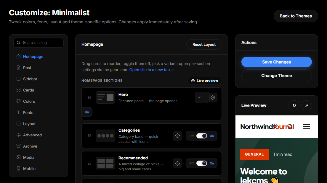
Nothing you change here touches a theme file. Values go into the database, keyed by theme slug, which is why a theme update never wipes your work and why switching themes and switching back brings your settings with you.
The customizer is a licensed feature. On a free install the screen is not available.
Where the panel comes from
A theme declares its tabs and fields under customizer.tabs in theme.json:
{
    "customizer": {
        "tabs": {
            "branding": {
                "label": { "tr": "Marka", "en": "Branding" },
                "icon": "palette",
                "fields": {
                    "accent": {
                        "type": "color",
                        "label": "Accent colour",
                        "default": "#2563eb",
                        "css_var": "--color-accent"
                    }
                }
            }
        }
    }
}
Each tab carries a label (a string, or a {tr, en} pair), an optional icon and description, and a fields map. Every theme that ships with jekcms declares its own set, typically branding, appearance, menu, homepage, single, footer and advanced.
A theme that declares no tabs at all falls back to a universal default schema - branding, typography, layout and advanced - so the customizer is never empty.
Field types
| Type | Renders as | |---|---| | color | Colour picker with a hex box; gets an automatic dark-mode twin | | font | Font dropdown where every option is shown in its own typeface | | range (or number) | Slider with a live value readout, honouring min, max, step and unit | | toggle (or checkbox) | On/off switch | | select | Dropdown, from a list or a key→label map | | choice_cards | Radio cards with a small CSS mock-up of each option | | textarea | Multi-line text box | | code | Monospace box, language picks the flavour | | image | Text field with a preview and a link to the media library | | url, text | Single-line inputs |
An unrecognised type falls back to a plain text input rather than failing, so a typo in a theme.json costs you a control, not a screen.
Beyond type, label and default, a field can carry help text, a placeholder, depends_on to show itself only when another field has a given value, optional to sit behind a "Customize" checkbox, and emit_saved_only so that nothing is written to the page until the user actually saves something.
Reading a value in a template
<?php $layout = theme_option('menu.layout', 'classic'); ?>The key is tab.field and the second argument is your fallback. An unsaved field, or one saved as an empty string, returns that fallback - which is the mechanism behind the "Theme default" option you see all over the customizer: empty means do not interfere.
theme_option() is the only function you need for this. It is different from theme_setting(), which each theme defines in its own functions.php and which reads the static settings block of theme.json - defaults baked into the theme, not anything a user can edit.
From a saved value to a CSS variable
Most of the time you do not read values in PHP at all. A field that declares a css_var is emitted automatically as a custom property, and your stylesheet consumes it.
<head>
    …
    <?php output_theme_customization_css(); ?>
</head>
Every shipped theme already calls this in its header template. It walks the schema, takes every field with a css_var, formats the value by type - colours are validated against a hex pattern, ranges get their unit appended, fonts become a full family stack - and prints one <style id="theme-customization"> block:
<style id="theme-customization">
:root {
    --color-accent: #dc2626;
    --font-heading: 'Fraunces', Georgia, serif;
    --container-max: 1200px;
}
</style>
Then your stylesheet just uses them:
.btn-primary { background: var(--color-accent); }A css_var may also be an array of names, in which case all of them are written. That is how one control drives several themes that happen to have named the same idea differently. The emitter also derives readable text colours for accent backgrounds automatically, so a --color-accent produces a matching --color-accent-ink without anyone specifying one.
The same block carries the styles generated by the universal studios and, last of all, your Custom CSS - so a rule you write there wins over everything above it.
Dark mode without doing the work twice
If a theme declares a dark-mode selector - the default is [data-theme="dark"] - every colour field with a css_var silently gains a paired dark field. The customizer shows the two side by side; the light value goes into :root and the dark value goes into a block under the theme's dark selector, printed after the theme's own dark rules so it wins at equal specificity.
Leave the dark value empty and nothing is written: the theme's own dark palette stays in charge. A theme can set "dark_selector": "media" to key off prefers-color-scheme instead, or false to opt out of the whole mechanism.
Controls every theme gets
Whatever a theme declares, core adds its own. These never collide with a theme's fields - a control is only injected when the theme has not defined one for the same idea - and while a control reads "Theme default" or is left empty, it writes nothing at all.
Colours picks up the eight colour roles a theme did not expose itself - primary, secondary, text, muted text, background, surface, border, link - each with a dark twin. Typography adds heading and body fonts from a curated library of about forty Google Fonts, heading weight, letter case, letter spacing and the article text column width. Branding gains separate logo-height sliders for the header and the footer.
On top of that sit the studios: the top bar and announcement strip, the main menu design, buttons, header and footer colours, card design, the share bar, comment section designs, the sidebar, the post page and the archive. Each is a core module that injects its fields into the relevant tab, which is why they behave identically across every theme.
Sections, order and device visibility
Themes declare their pages as reorderable section cards - hero, latest posts, category strips and so on - inside the customizer's page tabs. Drag a card to move it, switch it off, pick a variant, or open its gear for per-section settings.
The first setting in every gear panel is device visibility: all devices, desktop only, or mobile only. It is implemented with CSS media queries, so hiding a section on phones does not disturb the layout on the devices where it still appears.
Live preview
The preview button next to each section group opens your real site with your unsaved changes applied. Only your own admin session sees the draft; visitors keep the saved layout until you press Save. Desktop, tablet and mobile width buttons let you check both sides of a device-visibility rule before you commit to it.
Custom CSS and custom HTML
The Advanced tab of every shipped theme holds three code fields.
Custom CSS is appended last inside the customization style block, which makes it the right place for a one-off override you do not want to lose at the next theme update. Extra <head> HTML is injected just before </head> - verification meta tags, analytics snippets, a font you load yourself. Extra footer HTML goes in before </body>, for chat widgets and late-loading scripts.
The two HTML fields are printed exactly as you type them. Nothing is sanitised and nothing is validated, so paste only code you understand, and remember that a broken tag here breaks every page on the site.